
Actor website sin · #-8 of 31
Thou shalt follow through with thy designs
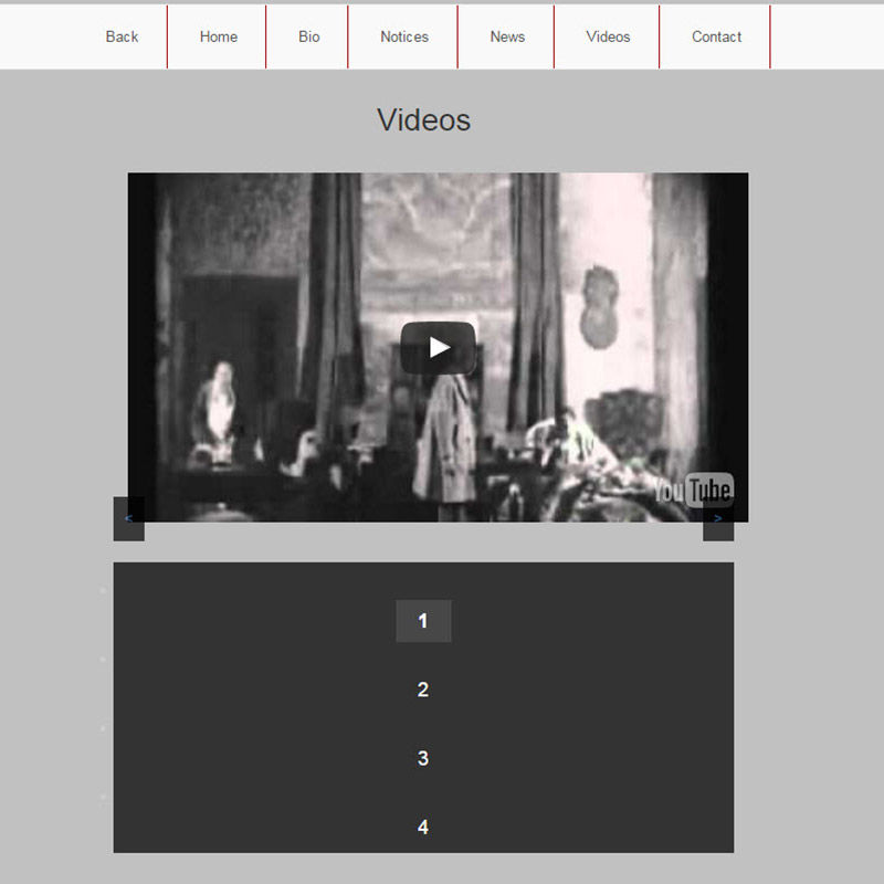
Incomplete designs on your actor website look unprofessional, and if people see anything like that it will be hard to unsee it. Let's take a look. There's a border on the right hand side of the menu, but nothing on the left. The video is shifted to the right making it look off-center. Navigation arrows are almost not visible the way they are positioned. Navigation buttons are huge (pronounce it like Donald Trump would pronounce it). Huge! and there are little white bullets on the left hand side. Just dark and gloomy.
This one is handled for you already.
Web For Actors builds the site, imports your credits, headshots and reels, and keeps them current. About 76 seconds, and it starts free.
Build mine free→